13 Spooktacular Halloween Ads & Marketing Campaigns
My routine as a content marketer looks pretty similar every Friday afternoon. As I schedule out our following week’s posts, I visit the National Day Calendar to see if there are any unique holidays we can leverage for social posts or giveaways. This activity has resulted in us celebrating everything from National Chocolate Covered Raisin Day to No Beard Day (yeah, that’s a real thing). Why do marketers have an incessant need to post about holidays? It’s simple.
Your holiday marketing efforts increase brand engagement.
Whether it’s an unconventional holiday or one of the staples, your audience likes having a reason to celebrate. For improved performance, you can also leverage hashtags to introduce your posts to a new audience. Not only can holiday-themed digital marketing impact your organic efforts, but holiday advertising has also been found to be very effective.
In fact, 89% of consumers reported that they find online advertising important in discovering new products and promotions. Furthermore, 31% said they believe they’re more receptive to ads during the holiday season (Integral Ad Science). While it’s easy to focus on the large holidays like Thanksgiving & Christmas, today we’re going to talk about some of the most effective Halloween advertising campaigns we’ve seen. Let’s dive in!
#1: Halloween Whopper – Burger King
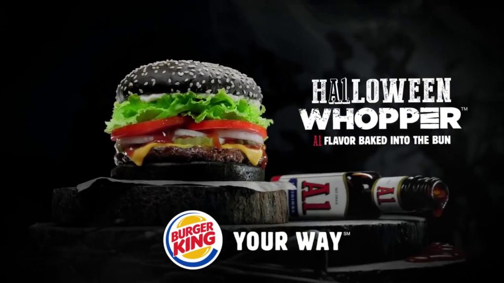
As if baking steak sauce into a bun wasn’t scary enough, Burger King’s advertising campaign surrounding the Halloween Whopper was hauntingly great. In advance of the 2015 Halloween season, Burger King previewed a new product by telling us “something wicked is coming” on Twitter. After years of selling colored Whoppers in Japan, Burger King graced their U.S. locations with this product that was saturated by a charcoal bun & 37 grams of fat.
Why we love it:
- The concept behind this advertising campaign translated across both social and traditional media.
- Not only was the imagery Halloween-themed, the product being advertised was too.
- The “A1” tucked away in the word “Halloween.” Brilliant.
- It… honestly looks pretty gross. But if we’ve learned anything about food marketing, sometimes even the least appetizing looking foods can draw the most buzz.
#2: The Horseless Headsman – Snickers
The advertising group BBDO New York produced this commercial for Snickers, which was the first of a series of “you’re not you when you’re hungry” videos in October 2012. To make things even spookier, the commercial was filmed by Craig Gillespie, the director of Fright Night. Snickers have been a long-time staple of the trick-or-treat season, and the tricks in this ad campaign were a total treat for viewers.
Why we love it:
- Humor makes ads more memorable – and the humor in this one still has us laughing nine years later.
- The “Horseless Headsman” went on to take over the Snickers Facebook page later that month, resulting in a series of funny posts. You know you’ve got something good when the character from an ad has a persona of his own.
- Though the treatment was novel, the slogan “you’re not you when you’re hungry” was a continuation for Snickers that predated this commercial. We love brand consistency.
#3: Booritos – Chipotle
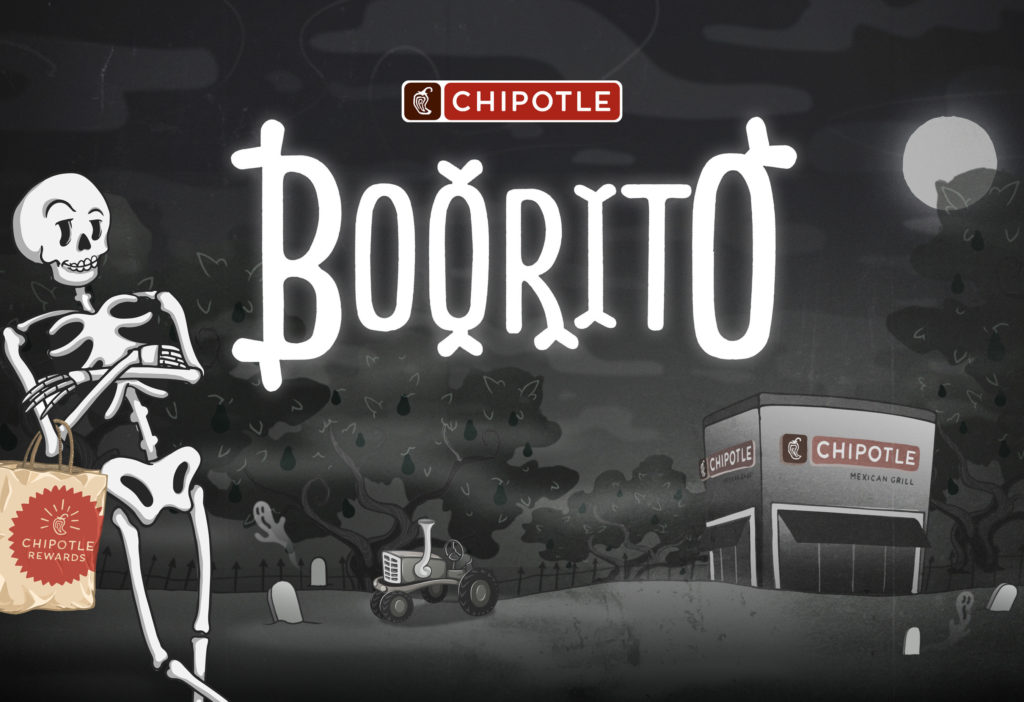
For Halloween 2009, I was dressed up as a burrito, standing in line at the Apple Valley, MN Chipotle, waiting for my discounted meal. The “Boorito Campaign” had influenced me well before I even knew what marketing was. Since 2000, Chipotle has celebrated spooky season by offering discounted entrees ($4 burritos, bowls, or tacos) for those who showed up in a costume. On their 20th anniversary of ‘Boorito’ last year, they even found a way to turn this campaign digital by posting limited access codes on their company’s social media platforms.
Why we love it:
- A campaign that spans 20+ years has to be good. We love that even in the midst of a pandemic, Chipotle found a way to keep their campaign thriving.
- The campaign promoted making Chipotle the go-to spot before or after a costume party.
- I can’t stop saying “boorito.”
- Throughout the years, Boorito has had several iterations – including a 2019 TikTok challenge with 5 “free burritos for a year” giveaways attached to it.
#4: Haunted Hotels – Booking.com
Okay, this one is genuinely spooky. Fans of horror have seen a dozen movies centered around a haunted hotel, and Booking.com found a perfect way to promote their business while aligning with the Halloween season. That’s what made this 2013 advertising campaign so great. This video, created by Wieden+Kennedy Amsterdam, was featured online, in movie theatres, on TV networks, and in posters. They even created a landing page (since shut down) at booking.com/haunted that displayed their haunted hotel offerings.
Why we love it:
- Marrying a creative concept with a landing page and actual CTA for people to check out your haunted hotel options? Very unique.
- The fact that this concept worked as videos AND in print ads makes it even more special.
- Your attention is captivated thinking that you’re seeing an actual movie trailer instead of an ad.
- The final call out of over 350,000 accommodations including haunted hotels made me want to scream “booking, dot, YEAH!”
#5: #BringOnTheCandy – Crest
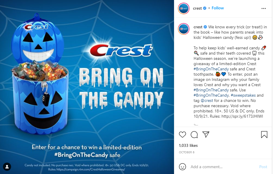
Did anyone else have a neighbor that only offered toothpaste or dental floss during trick-or-treating? Those houses were collectively labeled the “no-fun zone.” Crest wanted to make sure that, despite the fact they sell toothpaste, they still like to have fun. You should definitely brush your teeth – but it’s okay to still eat candy, and Crest has you covered. This sweepstakes giveaway from 2021 is a great marketing campaign for our favorite toothpaste company.
Why we love it:
- Once again, we love brand consistency. “Crest has you covered” has been a motto used by the toothpaste brand for a while, and we love the spooky treatment it received on this ad.
- Giveaways boost engagement. On Instagram alone, the #bringonthecandy campaign racked up over 4,000 posts using the hashtag in the first couple of weeks.
- This marketing campaign, mostly centered around social media, has helped position Crest as a fun brand, and helped shape the perception of Crest’s role during the Halloween season.
#6: Sleep in Dracula’s Castle – Airbnb
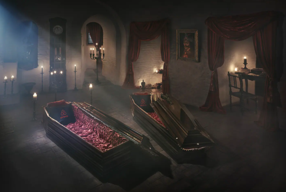
As someone who struggles to sleep peacefully in any new location, this is probably the worst prize I could imagine. But even I have to admit how cool this giveaway campaign from Airbnb was. In 2016, the online lodging marketplace offered a contest where the winners were flown to Romania to spend Halloween night in Castle Bran (Dracula’s Castle). As you could imagine, this campaign generated a ton of buzz for Airbnb (earned media through the roof!), and was a perfect way to connect their business with the Halloween season.
Why we love it:
- You’d be hard-pressed to find a more unique giveaway campaign than this one.
- In 2016, Airbnb was in a heavy growth period (twice as many users in 2016 than 2014), and campaigns like this helped launch them into being a household name.
- The giveaway wasn’t a gimmick. Airbnb went all in by paying for flights to Romania, bringing winners to the castle in a horse-drawn carriage, and even allowing visitors to sleep in plush coffins.
#7: Sweet or Treat – Krispy Kreme
As an agency that specializes in social media advertising, we love an attention-grabbing animation. In 2020, Krispy Kreme launched their “#SweetOrTreat” campaign where on select Saturdays in October, they’d offer a $1 special dozen of donuts with the purchase of any other dozen. As a Minnesotan, I regretfully didn’t have access to a Krispy Kreme store — that’s probably my only bad thing to say about this campaign.
Why we love it:
- The ad was right — 2020 was scary enough. This was a light & playful way to attach a company’s (sweet) offerings to the Halloween season.
- As noted before, the animation on this ad is GREAT. It captures your attention and demands you to continue watching the ad until completion.
- A promo code was required for this promotion to work, helping to make in-store purchases more trackable, and making it easier to gauge an actual return on investment for the ad efforts.
- The donut designs are perfect.
#8: Tomato Blood – Heinz
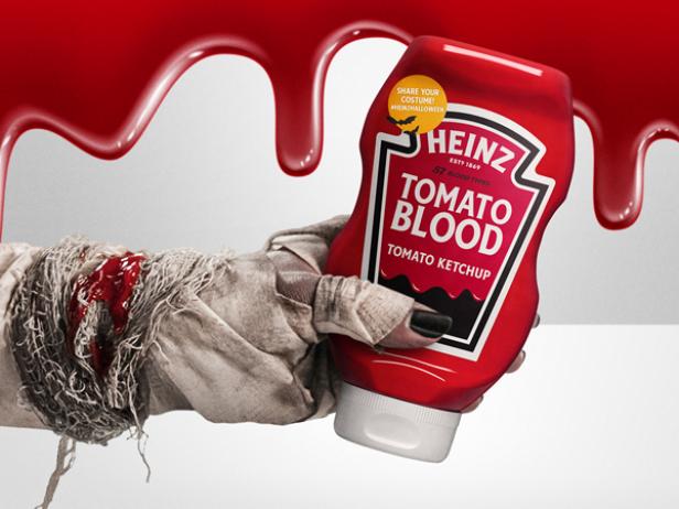
If you come across any fake zombies or draculas this season, check their fake blood to see if it’s actually ketchup. Using ketchup as fake blood has been a signature move for penny-pinchers and DIY costume-makers for years. Now, Heinz is leaning into it and going big by labeling their ketchup bottles as “tomato blood” for the 2021 Halloween season. This campaign involves limited-run packaging, merchandise, and a 15-second spot produced by Wieden+Kennedy NY to promote the product being sold at grocery stores across the country.
Why we love it:
- Self-awareness is great. Though the chefs behind Heinz’s original recipe ketchup would love to think it’s exclusively used for consumption, it’s okay to acknowledge a product can also be used as fake blood for Halloween.
- Taking this campaign one step further and actually selling a tomato blood costume kit? Love it. You can buy yours for $20.
- Though the product name is being changed and the label is switched up just a bit, the brand consistency is still prominent on this special, limited-run Heinz bottle. Great call on the design front of both the bottle and the ad.
#9: Halloween Dunk Lows – Nike
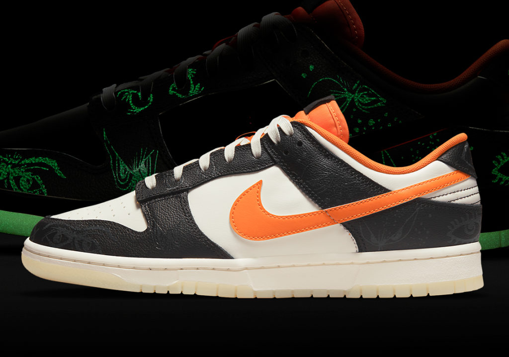
The Halloween season is typically known for outrageous fashion, but Nike is trying to switch that up. If I liked the color orange more, I’d probably buy these. Nike is celebrating the 2021 Halloween season with the release of a “Dunk Low” shoe that looks relatively ordinary in daylight, but glows to reveal a spooky pattern in the dark. This shoe, released in October 2021, is a great example of how product marketing can gel with a holiday season.
Why we love it:
- The subtlety of the imagery used in ad images for this campaign (including the image shown above) helps show a seemingly-normal shoe, while still displaying the glow-in-the-dark differentiator in the background.
- Try searching “Nike Dunk Low Halloween” on Google… you’ll be hard-pressed to find anything directly from Nike about it. When you get to a spot where you have so much brand loyalty and excitement around your products, the blogs and other media sources will handle the marketing process for you. We love that minimal ad spend was used to promote these new shoes, and instead, a mix of affiliate and organic efforts helped bolster the excitement.
#10: Horror Movie / It’s What You Do – Geico
Throughout my adolescence, I judged an ad’s effectiveness by how hard it could get my dad to laugh. This one was atop that list. Geico’s 2014 horror movie parody, produced by The Martin Agency catapulted the phrase “it’s what you do” into our insurance-loving brains. This video received placement through a variety of video sources (TV, social media, etc.) and even seven years later remains one of the most memorable Halloween commercials we’ve seen.
Why we love it:
- Taking all of the stereotypes from horror movies and somehow attaching it to a commercial about an insurance company? Well, it’s what Geico does.
- This commercial helped launch the “if you want to save 15% or more on car insurance, you switch to Geico. It’s what you do.” campaign that is memorable for so many of us to this day.
- The big glowing GEICO logo at the end of the video is a great final brand placement. Not crazy about “Happy GEICOween!” but that’s okay.
#11: Spider (Halloween Edition) – M&Ms
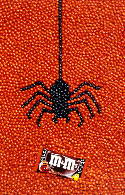
This is the second win for Mars, Inc. on my list of “top 13 halloween ad campaigns.” This German M&Ms ad was produced by BBDO Düsseldorf 20 years ago and used for print mediums during the 2001 Halloween season. Perhaps it’s just the nostalgia of early-2000s print design for me, but I love the simplicity of this magazine ad and the way it shows a spider lunging for a bag of delicious M&Ms (aka “num nums” in the Yakowicz household).
Why we love it:
- Sometimes, words aren’t necessary. This ad image has no copy on it whatsoever, but you still get the point — your Halloween is better when you have some M&Ms.
- Despite the simplicity of the overall design, I have to respect the photographer who had to perfectly build this black spider amongst a sea of orange M&Ms.
- Even without seeing the bag of M&Ms, I knew exactly what this ad was for.
#12: Netflix and Chills – Netflix
Have you ever thought about how “Netflix and chill” is an expression in virtually every American’s lexicon, but Netflix wasn’t the one who coined the term? Okay, maybe that’s just me. What I love about this, however, is that Netflix is finding a way to play off the expression while promoting the spooky series and movies that are available on their streaming platform. This marketing campaign, launched by Netflix in advance of the 2018 Halloween season, highlighted some of the great offerings available on Netflix, and was played across social media and TV placements.
Why we love it:
- We love all things punny. Not only is “Netflix & Chills” great wordplay, but the “Now screaming” at the end of the video is another subtle touch.
- Netflix didn’t spend a whole 60 seconds promoting their own brand. In fact, it felt more like an advertisement for each individual show or series than for Netflix as a whole.
- The background music throughout the ad was from a Netflix original show (Stranger Things), which true Netflix brand advocates will appreciate.
- Who doesn’t want to find a great spooky movie or TV show to watch in October? Netflix hit with messaging at the perfect time.
#13: The Shining Parody – Ikea
Red rum, red rum. One of the most popular horror films of all time, “The Shining,” was parodied in this 2014 commercial for IKEA Singapore. The classic tricycle scene from the Jack Nicholson movie was a little less sinister in this commercial which shows a boy enjoying the wonders of a maze-like IKEA store. The commercial leveraged the Halloween season to promote late night shopping. Though there are spooky elements mixed in, we still get the happy ending that can only come with paying for modern, affordably-priced furniture.
Why we love it:
- Parodying a movie like “The Shining” which is one of the most critically-acclaimed horror movies of all time is a great choice.
- Promoting something like late night shopping aligns well with the Halloween season.
- The humorous touch of mom & dad in the twin dresses is the chef’s kiss in this commercial.
As a consumer, holidays like Halloween present a great time to get out and support both national and local businesses. As a marketer, there are some wonderful opportunities to leverage the holiday buzz and use it to influence your marketing campaigns. If you’d like to discuss how our team at AdShark can help shape your digital advertising efforts, we’d be happy to help. Feel free to contact us to discuss your business’ goals and your (spooky) ideas! Thanks for reading.
Ready To Grow?
Let's Talk!


