How to Create A High-Converting Landing Page for Google Ad Success
You’re running Google Ads, and you notice you’re getting clicks, but conversions are lagging. The issue may not be your ad, but your landing page. A high-converting landing page is crucial for your Google Ad success, and to achieve your business goals.
Let’s learn how you can create a high-converting landing page that will improve your Google Ad success rate.
What is a High-Converting Landing Page?
A high-converting landing page is a web page specifically designed to encourage users to take some sort of action on their website. This could be submitting a form, calling a number, or purchasing a product.
Here are the three things you should look for when evaluating your landing page:
- Load speed: If you have a slow website that takes forever to load, users are going to jump ship, fast.
- Clarity: If your landing page is confusing, users won’t want to take the time to learn or educate themselves on your product/service. Instead, they’ll find a website that makes more sense and answers all their questions right away. Make sure your landing page is clear, concise, and provides users with all the information they need.
- Simplicity: You should give users all of the information they need, but you need to do it as simple as possible. Bombarding them with information and fluff will only confuse them, so keep it simple.
If your website is slow to load, lacks clarity, and is not an easy user experience, this could be detrimental to your Google Ad performance.
Best Practices for Designing a High-Converting Landing Page for Google Ads
Your Google Ad should lead to a landing page that is easy to navigate and explains everything well without an information overload.
Here’s how to design a high-converting landing page for Google Ads:
Focus on Relevance and Alignment with your Google Ads
Make sure your Google Ad and landing page align with each other. The headline and content should reflect the promise made in the ad to maintain consistency and user interest.
This boosts both quality scores and conversion rates by assuring users they’ve arrived at the right place.
Craft a Clear and Compelling Call-to-Action (CTA)
The CTA should be easily visible and persuasive. Use action-oriented language like “Get Started” or “Claim Your Offer” to encourage immediate action.
The CTA needs to be front and center on the landing page so users don’t have to scroll to find what they want. Users won’t want to waste their time trying to find the right information, and it will cause them to exit the site before converting.
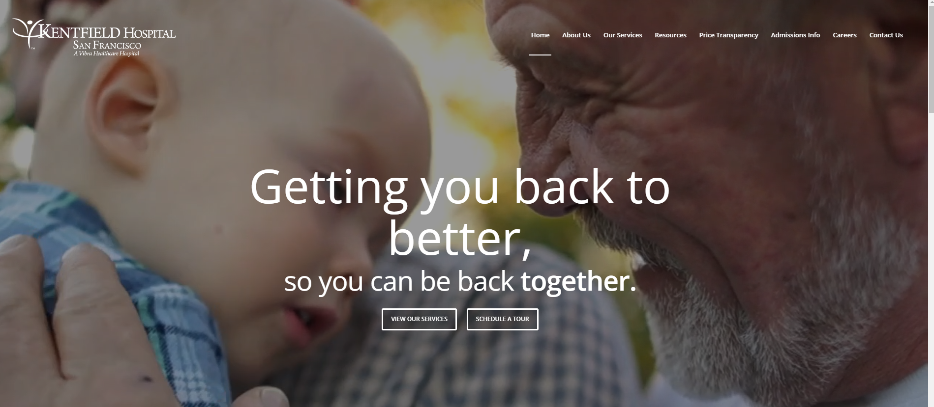
This is a great example of a home page. It is clear, to the point, and has a powerful CTA with a simple design.
Design for Speed and Mobile Optimization
If your landing page takes a while to load and isn’t a seamless experience for the user, your bounce rate is certain to increase.
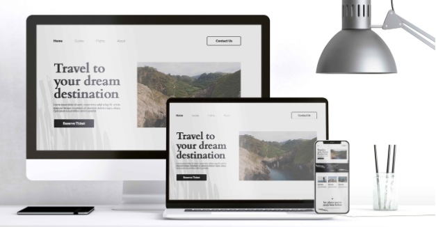
You also want to make sure that your landing page looks good from a mobile device. Most users are finding information through their phones, so you’ll want to be sure your content is optimized for mobile devices.
Keep the Design Clean and Simple
A clutter-free design helps users focus on the primary goal of the page—conversion. Minimize distractions such as unnecessary navigation menus, pop-ups, or excessive content.
My best advice? Use white space effectively and keep the page visually appealing to guide users toward the CTA.
Use Testimonials and Social Proof
Including customer testimonials, trust badges, or case studies builds credibility and reassures users about the quality of your product or service.
Trust signals help reduce hesitation and increase conversions.
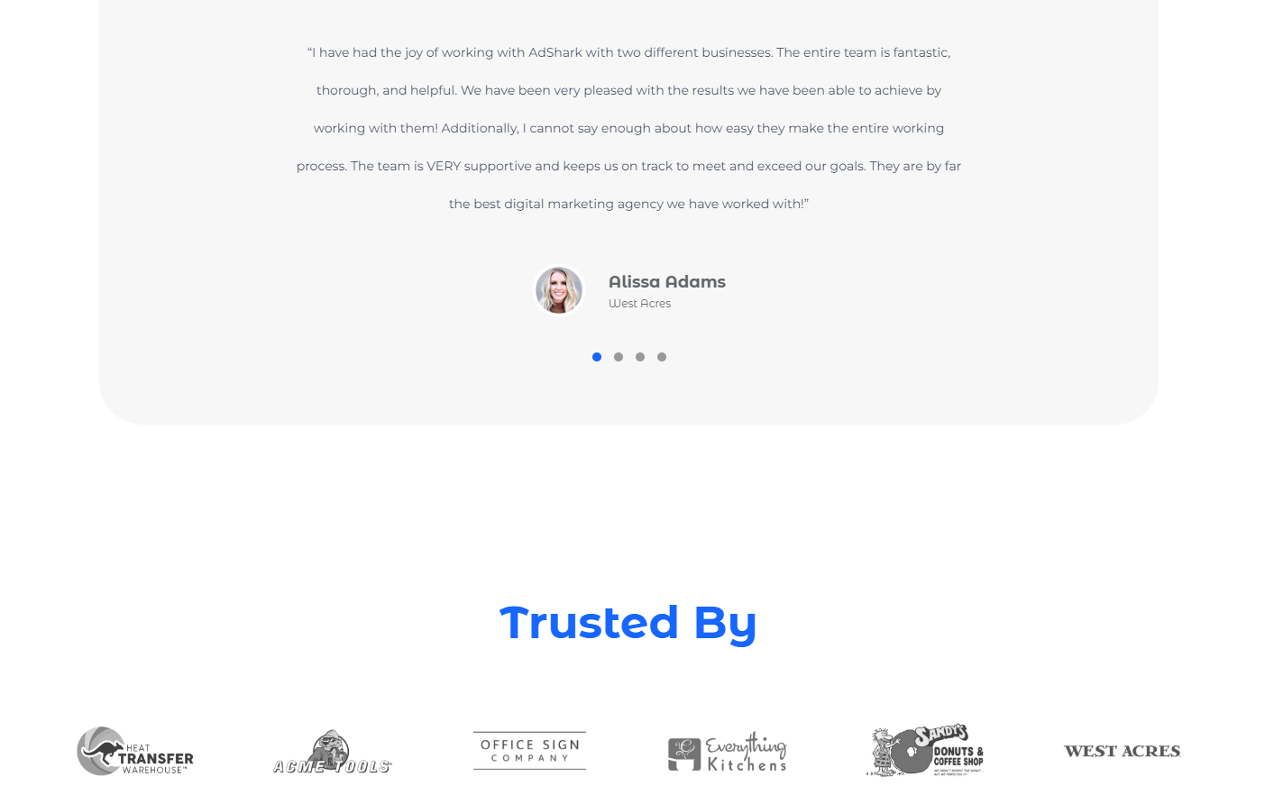
Our website has a carousel of testimonials and brands that trust us with our services. This is appealing to potential clients because it gives us authority and credibility.
Thanks for reading along, I hope this gave you some tips on how to improve your landing page, and Google Ad performance as well! Have a landing page that needs fixing? We can help with that! Contact us to have us redo your website, and see the benefits for yourself!
Ready To Grow?
Let's Talk!
