8 Web Design Inspirations for Food eCommerce Companies in 2023
There are over 150,000 food eCommerce websites in the United States alone. What separates the top stores from the rest of the pack? Good food. But what makes us want to order in the first place? A strong web design.
A few months ago, we published a blog about the 23 steps you need to consider when launching a new website. Step 3 involved creating an inspiration list of website examples that will help you get started.
Building an inspiration list of websites is helpful in many ways, including:
- Helping to jumpstart your creativity
- Identifying design characteristics you’d like to emulate in your website
- Developing content and page ideas
- Providing guidance for your web designer or web design agency
If you oversee the marketing efforts for an online retailer of food or beverages, this blog is for you. We scoured the internet to find 10 of our favorite food eCommerce websites and are excited to share that list with you.
Let’s dive in!
#1 – Cheese Brothers (Barron, WI)
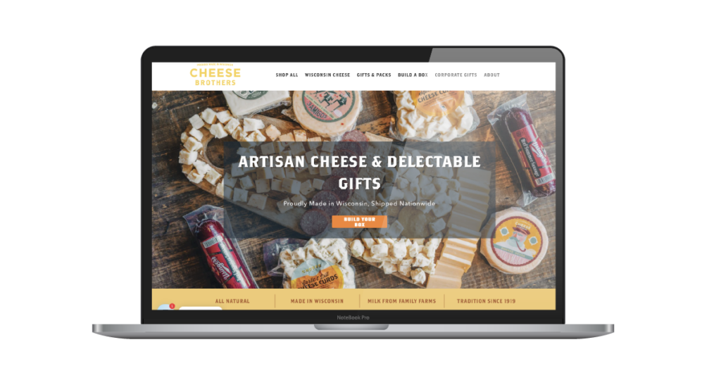
Wisconsin knows cheese. It also appears to know good web design. This food eCommerce storefront sells artisan cheeses, cured meats, and more, and offers some pretty great features (including a Build Your Own Box). To help quell the concerns of people who are unaccustomed to buying dairy products online? They offer a no-questions-asked guarantee on every order.
Link to Website:
Web Platform Used:
Shopify.
5 Website Features We Liked Most:
- The “spin to win” cheese wheel when you first get to their site – adding gamification to your first order discount
- Content that tells the family story, provides consumer confidence with the sourcing of their milk and cheese products, etc.
- The ability to build a custom gift box
- Corporate gifting options with a lead gen form for businesses interested in purchasing for their employees or clients
- Clean, minimal design to keep the core focus on the products being sold
#2 – Jeni’s Splendid Ice Creams (Columbus, OH)
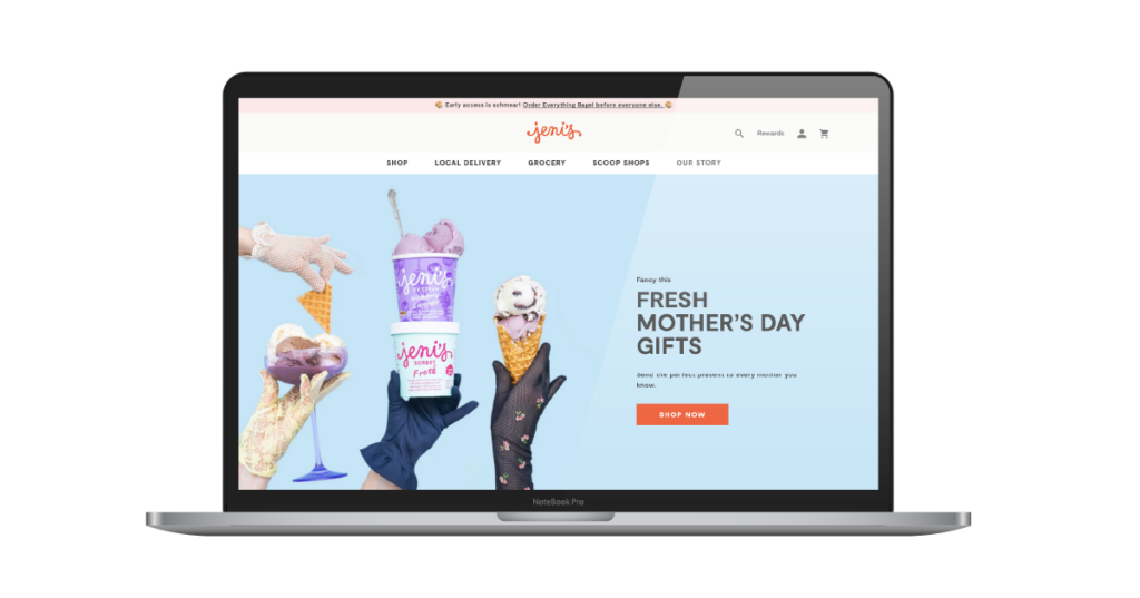
The logistics involved to make sure that pints of ice cream get delivered to customers across the nation without melting makes our heads spin. But this website is so tastefully put together that we can’t help but want to become customers. Jeni’s business involves 23 scoop shops across the country + an online storefront for customers to buy anywhere.
Link to Website:
Web Platform Used:
Shopify.
5 Website Features We Liked Most:
- The banner at the top of the page that links out to their newest product.
- A “pint club” subscription option for customers who are looking to start a 3-, 6-, or 12-month subscription.
- Great product photography that shows the product, the packaging, and uses bright colors to draw the eyes in.
- A hero banner that changes out based on the season and reason for buying (i.e. Mothers Day specials).
- Great content detailing how the ice cream will arrive, and the packaging that is used, to help add comfort for first-time customers.
#3 – Daily Harvest (New York, NY)
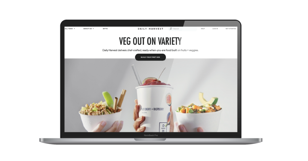
In their own words, Daily Harvest offers “chef-crafted, ready-when-you-are food built on fruits + veggies.” Daily Harvest’s food eCommerce storefront offers subscriptions to help you eat delicious & healthy meals. With a business model that is built for working professionals or individuals on-the-go, their storefront (displaying minimalistic design and unique product photos) is incredibly appealing for their target audience.
Link to Website:
https://www.daily-harvest.com/
Web Platform Used:
Contentful (custom).
5 Website Features We Liked Most:
- Promo codes offered to first time users – with deals that are almost too sweet not to buy (i.e. $20 off 9 items, $25 off 14 items, $35 off 24 items).
- Hero banner video that shows some delicious-looking meals and highlights the variety that is offered.
- Showing brand ambassadors / health influencers who also use Daily Harvest and share their tips & tricks to eating fruits and veggies.
- Highlighting the charitable work that Daily Harvest is doing to improve biodiversity (connecting the consumer with a cause).
- A helpful “get started” feature that makes the first order process easy.
#4 – Popcornopolis (Horsham, PA)
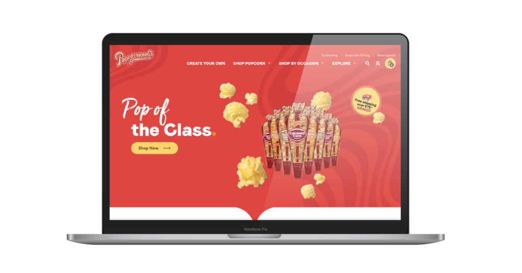
In the popcorn industry, you want a website that can POP as much as your kernels. Popcornopolis definitely rose to the occasion. This food eCommerce storefront found a perfect balance of helpful content & conversion rate optimization best practices. They not only share their own story, but also provide education about popcorn in general – all in an effort to help potential customers feel more assured about the product(s) they’re purchasing.
Link to Website:
https://www.popcornopolis.com/
Web Platform Used:
WooCommerce (WordPress).
5 Website Features We Liked Most:
- Multiple menu dropdown options, including “shop popcorn” (allowing you to choose by the type of popcorn) or “shop by occasion” (allowing you to choose based on your occasion for buying). This is great for both SEO and user experience.
- Great use of illustrations next to popcorn types under the “shop popcorn” tab to help make it more clear what you’ll find in that category.
- Good use of brand elements and colors throughout the website to add to the experience – helps it feel like you’re in a popcorn shop.
- A “create your own” option allowing you to personalize your popcorn packages for larger orders.
- A “fundraising” page that allows you to have your organization (i.e. little league baseball) sell Popcornopolis popcorn and you keep 50% of the proceeds.
#5 – The Peach Truck (Nashville, TN)
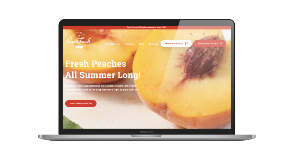
Food eCommerce companies vary immensely in terms of inventory. You’ll find some fruit vendors, for example, that have thousands of SKUs on their website. And then you’ll find others, like The Peach Truck, that specialize in one specific niche (peaches) and do it extraordinarily well. We were very impressed by the imagery & brand design elements used throughout the site, and equally inspired by the content and text they used to describe why you should choose their peaches.
Link to Website:
Web Platform Used:
Shopify.
5 Website Features We Liked Most:
- Clear calls-to-action in the menu portion – with the ability to shop delivery or shop local pickup options.
- The content on the “our difference” page that specifically calls out their brand differentiators and why you should choose The Peach Truck for your peaches.
- Simple product options with limited ability to get “overwhelmed” or “paralyzed” by which product to select. Also love that you can do a one-time box or set up a subscription.
- A rewards program (“Truck Bucks”) that is used to incentivize more brand loyalty and repeat purchases.
- Logos of known brands (i.e. New York Times, Food Network, etc.) who have featured stories about The Peach Truck in the past – to help build authority and increase purchaser comfort.
#6 – TRUFF (Huntington Beach, CA)
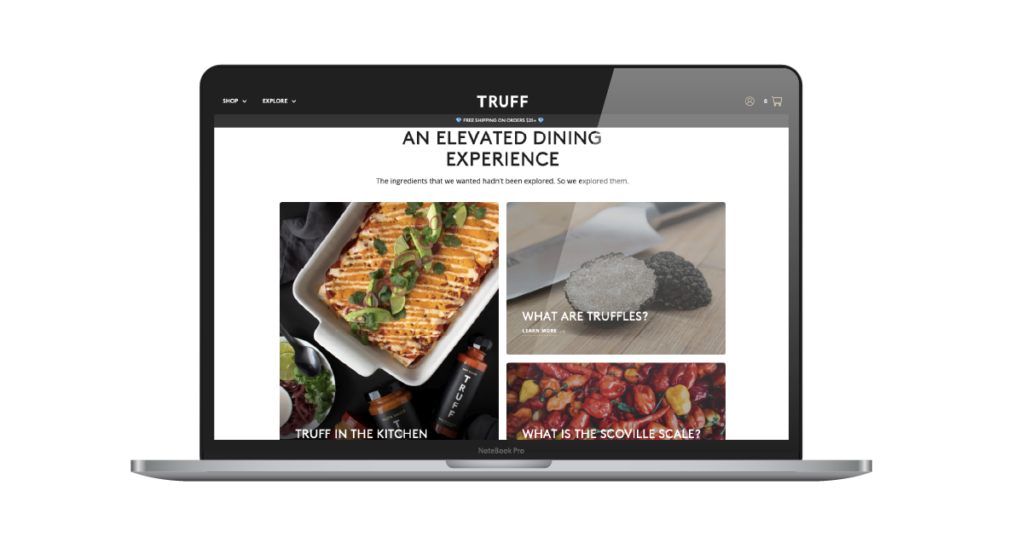
A famous poet named Future once said “I got too much sauce.” He must have been a longtime customer of TRUFF. TRUFF has a great example of a food eCommerce site that offers a clean user experience and builds excitement around their products. Not only do they have great product imagery and brand elements throughout, but they were very thoughtful about the content that could accompany their product pages – including secondary pages devoted to recipes, rewards, subscriptions, and more.
Link to Website:
Web Platform Used:
Netlify (custom).
5 Website Features We Liked Most:
- An offer is presented (“how does 10% off your first order sound?”) when you first get to their website, to help incentivize first time purchasers.
- Previews of recent social posts at the bottom of the home page to show the various ways that people are using Truff sauce.
- The use of a RECIPES page to show some inspirations/ways that their sauces can be used in various meals.
- Product previews are shown from the home page menu when you click the “Shop” dropdown (to make it even easier to determine which product to view).
- Super clean use of branding elements throughout the entire website that are consistent with the packaging for the product.
#7 – The Brooklyn Hot Dog Company
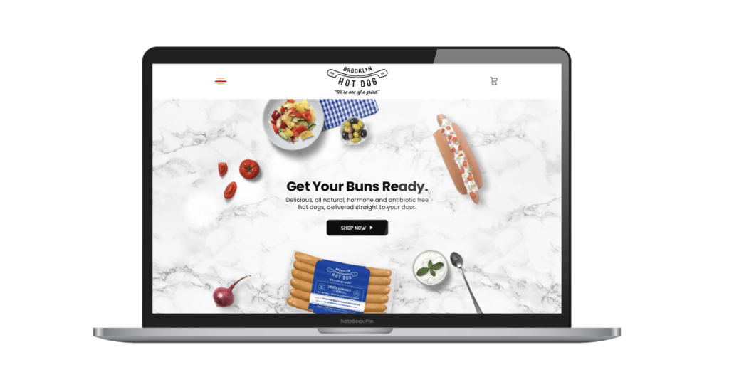
What screams New York more than a hot dog? Fortunately, The Brooklyn Hot Dog Company brings the flavors of New York hot dogs to their customers across the nation through their food eCommerce business. Scrolling through this storefront is a delightful experience, as it’s littered with puns and playful taglines, and features some of the nicer product photos you’ll see.
Link to Website:
https://www.brooklynhotdogcompany.com/
Web Platform Used:
Shopify.
5 Website Features We Liked Most:
- The copywriting – plenty of hot dog-themed puns and tongue-in-cheek references that help you get a better feel for the brand.
- The home page section that invites you to “meat” the family, and scrolls through the variety of hot dog flavors that are offered.
- The animation of hot dog packages falling into the box – both introducing you to the packaging/branding, and also serving as a unique design element.
- The “hamburger” menu at the top of the page has a longer second line, making it more of a “hot dog” menu.
- Strong use of secondary pages to help complement their product information – including a well-written and helpful “recipes” page and “our story” page.
#8 – Wildgrain (Boston, MA)
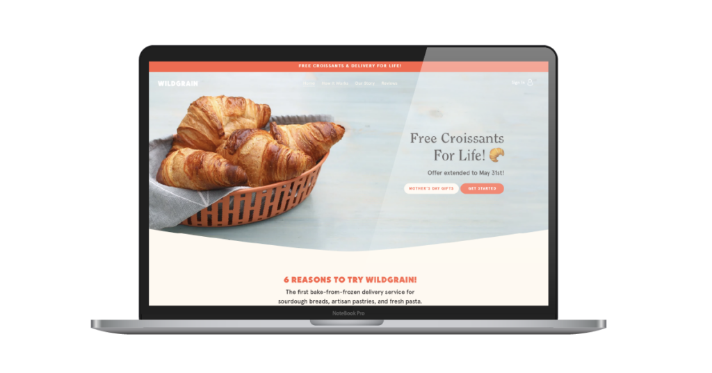
Wildgrain is a food eCommerce company that sells bread, pasta, and pastries. As a self-proclaimed ‘small bakery,’ this is an inspirational site for online food retailers of all shapes and sizes – as it doesn’t give off ‘small bakery budget’ vibes. They paired excellent content with great product images & strong UI/UX. Though there’s no shortage of places to buy sourdough, it didn’t take us too long on this site to feel inspired to get a loaf for our office.
Link to Website:
Web Platform Used:
Shopify.
5 Website Features We Liked Most:
- Clean design with a great use of brand assets throughout (imagery, custom fonts, design elements, etc.).
- A well-designed hero banner with an offer that is very enticing for first-time customers (i.e. free croissants for life!).
- Helpful content and illustrations on the “how it works” page to help first-time customers have a better understanding of the ordering experience.
- An “our story” page that was written by the co-founders of the business, and even includes a signature to authenticate that this is real food made by real people.
- The inclusion of verified buyer reviews on their site (and product pages) to help add more proof of how good their products are before buying.
Honorable Mention: PotatoParcel.com
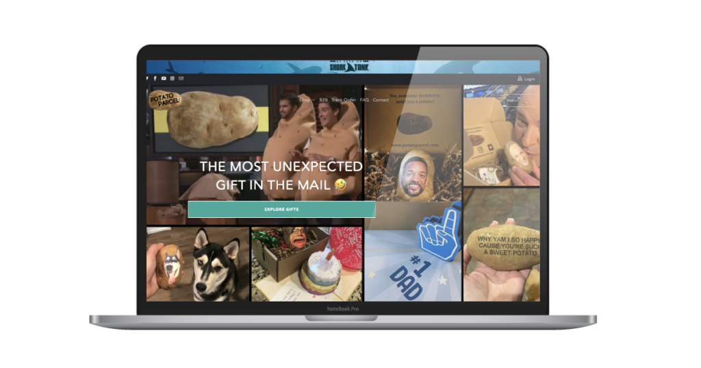
Alright, we don’t love the web design here – but we couldn’t believe how unique of an idea this business was. We had to give it some shine in our blog. Special bonus points if anybody reads this blog and sends us a potato with the AdShark logo (or the blog writer’s face) on it. Well done, Potato Parcel.
If you’re looking for assistance in designing a website for your food eCommerce business, we’d love to help! If you’d like to learn more about our web design process, please contact our team for a free estimate on our eCommerce services. In the meantime, go out and support any of these food eCommerce businesses!
Ready To Grow?
Let's Talk!
