How To Design Killer Facebook Ads That Get Results
There are more than 3 billion active users on social media and 11 new social profiles created every second. Facebook still dominates with more than 2 billion active monthly users. As marketers, we can’t ignore this social media behemoth.
Because of their diverse population and massive amounts of user data, we have the ability to execute extremely targeted ads. And as an added bonus, Facebook’s cost per thousand impressions (CPM) is relatively low with a higher return on investment than traditional media.
Just boosting a popular post isn’t necessarily the best tactic to take. So, the million-dollar question remains, “How can my ad stand out from all the competition?”
It’s true, there is a lot of competition on Facebook. Not only are you competing with sponsored content, but you are also competing with Aunt Mary’s cat posts and your cousin’s cute kids.
The good news: We have tested different tactics to provide you tips on how to design the perfect Facebook ad that gets results. We are also sharing our free template to help you quickly and easily create Facebook ad mock-ups.
[contact-form-7 id=”7520″ title=”Blog Download – Facebook Ad Template”]
What’s In This Post?
- Facebook Ad Goals
- Facebook Ad Formats
- Design Tips For All Facebook Ad Formats
- Design Tips For Facebook Image Ads
- Design Tips for Facebook Video Ads
- Design Tips For Facebook Slideshow Ads
- Design Tips For Facebook Carousel Ads
- Design Tips for Facebook Collection Ads
- Design Tips for Adding Instant Experiences to Your Ads
- Strategic Objectives and Consistency Drive Facebook Ad Success
- How Can AdShark Marketing Help
Your Goal Isn’t to Have the Prettiest Colors and Fanciest Video (But You Should be Testing Them)
“Most people make the mistake of thinking design is what it looks like. People think it’s this veneer – that the designers are handed this box and told, “Make it look good!” That’s not what we think design is. It’s not just what it looks like and feels like. Design is how it works.”
Before we even get into design elements, we have to cover objectives and targeting. Having campaign goals and objectives are the cornerstone for effective Facebook ads (and all marketing, honestly).
There is a huge difference between creating brand awareness and increasing sales for a certain product or product category, and Facebook serves up ads depending on what your ultimate goal is.
They break them into three main categories: awareness, consideration, and conversion.
Raise Awareness
You want people to know who you are. Goals can include:
- Building brand awareness
- Increasing reach
- Increasing video views
Grow Engagement (consideration)
You want someone to engage with your product, brand or content. Goals can include:
- Increase app traffic and installs
- Increase website traffic
- Improve page, post or event engagement
- Drive more leads
- Increase offer claims
- Increase video views
- Improve interactions with messages
Boost Conversions
- Improve website conversions
- Improve app conversions
- Grow Catalog Sales
- Increase in-store visits
- Drive offline conversions
You also need to understand the audience you are trying to reach. The targeting tools built into Ads Manager will help you reach people based on demographics, location, interests, and behaviors.
Pro tip: “Developing buyer personas for your ads will help improve your ad creative and simplify the process of selecting your audience.”
Picking the Best Facebook Ad Format For Your Goals
Facebook is constantly releasing more features and formats for advertisers. Since 2016, Facebook has released multiple formats that have helped improve conversions and ROI.
Currently, there are 5 different formats:
- Image Use visuals to drive people to a destination app or website.
- Video Draw people in with motion or sound and feature products in use.
- Slideshow Use motion, sound and text to tell a story on any connection.
- Carousel Showcase multiple products within a single ad and link to each individual product
- Collection Feature product catalog customized to each user, encouraging shopping
Facebook also offers instant experiences, formerly known as canvas ads, which they released in 2016. They allow advertisers to create a unique, relevant and mobile-optimized experience that can be used to bypass a brand’s website and act as a landing page if desired.
Determining which format to use and what action you want your target audience to take is an important step in getting the best results from your campaign.
Design Tips For All Facebook Ads
Before we get into the individual Facebook Ad Formats, I’d like to highlight some design tips that are the same no matter what format you choose. These things should be top of mind when designing your next ad.
Test Test Test
Testing is Facebook’s version of location for real estate. Small tweaks to your ad whether it’s the image, the CTA or simple phrases could make a huge difference on the success of your campaign.
Using the split testing feature on Facebook allows you to test multiple variables. You can test target audience, delivery optimization, placements, creative and product sets.
For best results, stick to testing one variable at a time. Facebook recommends keeping the test running for 3-14 days. Once you see one ad outperforming the other you can shut the underperforming ad off.
Design for Mobile
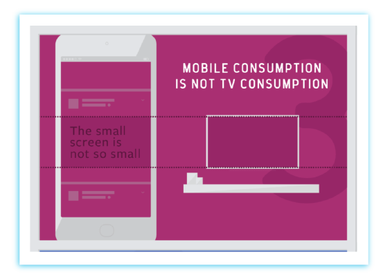
95% of impressions are mobile. And the way people are consuming mobile content is different than traditional channels. It’s important that all your ads are designed for mobile.
But it’s not only because of how we consume content, following ad dimension guidelines and character count is important so your messages aren’t cut off.
Keep Content Simple
Mobile users, on average, spend only 1.7 seconds with any given piece of content. Whether you are creating a video ad or collection ad you want to make sure that your copy is clear, concise and consistent.
Choose one message and let your image or video do the talking. For a deeper dive into ad copy check out our post, “How to write Fantastic Facebook Ad Copy.”
Call-To-Action
At the end of the day, your ad is created to prompt someone to take an action. The call-to-action (CTA) is the most important part of your ad. You want to make sure you choose the right one based on what your objective is.
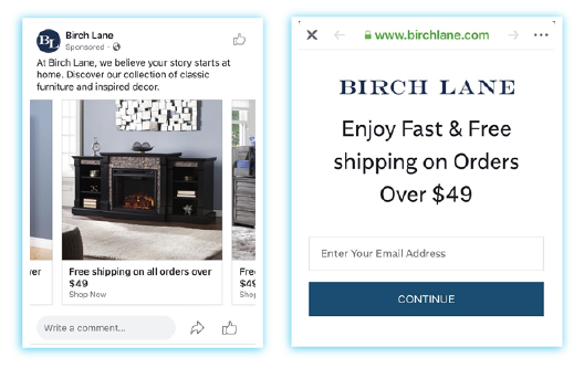
As you can see in this Birch Lane carousel ad, they included lifestyle images of their products, clear messaging and the “Shop Now” CTA. Once I clicked on it, it brought me to an email sign-up landing page, not the items I was expecting. Changing the CTA to “Sign Up” would be more effective and provide a better user experience.
Consistent Content on Ad and Landing Page
Keeping your ad consistent with your landing page is also extremely important. Because the Birch Lane ad didn’t bring me to the items featured on their carousel ad, I immediately left without taking an action. Matching their ad and their landing page content to their goal would most likely improve the results of this ad.
Design Tips For Facebook Image Ads
Photo ads are the most widely used format. They are used to create brand awareness and drive traffic to your site. Here are some tips for designing effective image ads:
Let the Image Do the Talking
Content is secondary in Facebook ads. Featuring your product prominently or using people in your ad are a couple of ways to put the focus on the image. You can also try adding contrast to your photo with Instagram-like filters.
Play with Colors
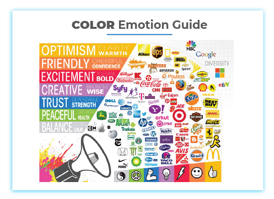
Every color is perceived differently and can change a person’s mood. There have been multiple studies done on the psychology of color and this holds true for marketing and branding.
Add Text to Your Image (but don’t go crazy)
Ads with text in the image can help catch someone’s attention and improve clicks or conversions. This is true for CTAs, using urgency or offers.
You have to be careful not to put too much text within your ad. Your ad should have less than 20% text on the image itself or Facebook will not approve it. This adparlor tool allows you to mockup an ad and will check for the 20% rule. You can also verify it with the Facebook Ad tool.
Use Your Image to Help With Location Ads
Location targeting is an amazing feature. If you have an event or a retail store you can set your ad for that location and its surrounding areas. Use a familiar image of your location or add the location name in the image, reinforcing your message and personalizing your ad.
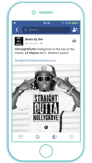
Image and Location: Beats by Dre promoted the release of Straight Outta Compton using the idea that everyone is “straight outta” somewhere. They used location targeting to personalize the ad.
Design Tips for Facebook Video Ads
Video ads help you tell a story and Facebook gets more than 8 billion average daily video views, becoming a top player in social media video. Videos can help launch a product, tell your brand story or showcase a how-to.
Keep it Short and Simple
The influence of mobile on how we consume content is driving changes in how marketers get their messages out. Our attention spans are getting shorter and shorter, so you have to pay attention to length. And you need to put the most important information in the first 3 seconds—your branding and your message.
Newsfeed videos have a huge drop off right away, so it’s also important to promote your CTA in the middle—thus avoiding the large drop-off.
Produce for Visuals Not Audio
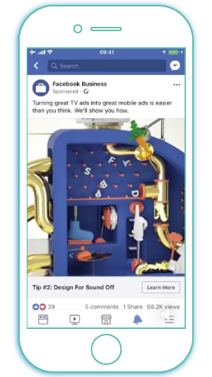
In 2016, 85% of Facebook video views happened with the sound OFF! So, if you’re producing a Facebook video like you would a TV spot, you’re doing it wrong.
Facebook recommends adding captions to your video to ensure your message comes across with and without the sound. Think of the silent movie era, sound was a value-add, not a necessity.
Facebook created a video showcasing a design tip for their video ads. The use of captions showcases how effective a video can be with the sound off.
Size and Specs Matter
Have you ever thought about changing the size of your video to square or filming a vertical video? If you have, you should try it! Because 95% of users are using Facebook on mobile, it’s important to optimize your video for mobile viewing.
A square ad takes up 78% more screen space than landscape in the mobile newsfeed. And as an added bonus, square videos are known to outperform landscape videos. No one likes flipping their phone, so creating a vertical ad provides a larger landscape and a better user experience.
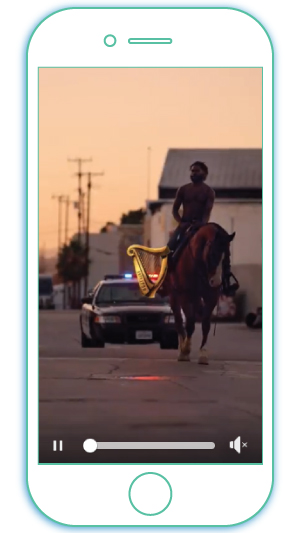
Guinness filmed a short video entirely in a vertical orientation, highlighting its effectiveness.
Facebook has specific recommendations for file size, length, compression, and resolution. Make sure to pay close attention to them before formatting your video.
Generate Curiosity with the Thumbnail, Title, and Description
When creating your video ad, Facebook generates 10 images to choose from for the thumbnail. You can also add your own, but you should be very strategic about what you choose.
You want the image to be interesting enough for someone to click on it. If you choose your own, remember the 20% text area rule. You don’t want your ad penalized for too much text. You can get Facebook’s OK using their image check tool or use adparlor’s mockup tool.
Including keywords in your title and description is not only important for engaging an audience, but it’s also important for Facebook’s targeting algorithms. Catchy titles are also important—and just like blog headlines—list headlines, how to headlines and questions do really well.
But the most important thing to keep in mind is that your title and description are relevant to the content of the video.
Design Tips For Facebook Slideshow Ads
Slideshow ads are perfect for those of us who don’t have access to video equipment, time to produce a video or the money it takes to outsource it.
They are video-like ads using motion and sound that you can use to build brand awareness, tell your business story, highlight benefits or feature products. They can reach anyone around the world, even those with limited bandwidth.
Focus on Strong Creative
You are letting the images do the talking with slideshow ads. Make sure the images are high-resolution or you can use an existing video. You can also use stock photography if needed. Pay attention to the first image, it needs to be the attention-getter. Experiment with cropping, reordering or applying a transition when testing.
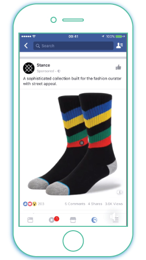
Stance Socks used vibrant product images to showcase their huge range of socks.
Be Specific About the Length and Number of Images
Facebook suggests starting with 3-10 images and keeping your slideshow under 15 seconds. Remember that our attention spans are extremely short.
Be Consistent
Copy, call-to-action, image, and destination need to all align. Keep your text concise and to the point and make sure everything aligns with your objective.
Design Tips For Facebook Carousel Ads
Carousel Ads can showcase up to 10 images or videos in a single ad. Each image or video can have its own link, perfect for showcasing individual products, highlighting features and benefits of a service or telling your brand story. Carousel ads are a great ecommerce marketing tool.
Show Multiple Products
Use a carousel to showcase multiple products and link each product to a different landing page.
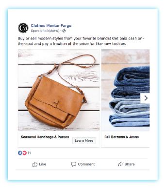
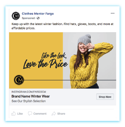
One of our clients, Clothes Mentor Fargo, wanted to showcase the different types of products they sell and buy. They featured different product categories in this Facebook Carousel Ad example.
Highlight Features or Benefits
Each card is an opportunity to cover features or benefits of a more complex product or service, informing customers of the details.
Video and Images Can Tell Your Story
Order matters. And you have the ability to optimize the order of each card, so you can tell a story sequentially. You can also mix it up by using either video, images or both—be creative.
Design Tips for Facebook Collection Ads
Collection ads include a cover image or video and a collection of several product images that opens an instant experience when clicked.
They are built for mobile only with engagement in mind. And they deliver, bringing high-value traffic to your online store. Collection ads are proven to drive higher conversions and increase ROI.
Cover Image or Cover Video?
Your cover image or video is extremely important. Videos tend to drive better results. However, if you don’t have the means to create a video, slideshows are a less expensive and less time-consuming way to incorporate video.
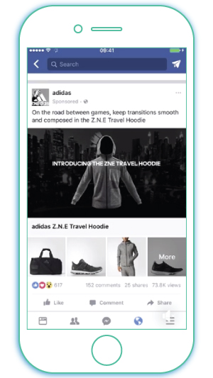
Adidas showcased a video with product features, then displayed complementary products to drive cross-selling.
Images
Once again visuals tell the story. Creatively using images helps to drive engagement and conversions. Showcasing products in lifestyle images or videos and then displaying those products below and available to purchase will instantly affect sales.
Templates
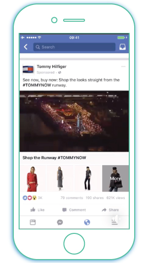
Tommy Hilfiger featured a video of the runway launching his fall collection with products displayed directly below that, transforming his runway show into a mobile shopping event.
Pair your collection ad with an Instant Experience template to provide a seamless transition for people to learn more without leaving Facebook. Templates include Instant Storefront, Instant Lookbook, Instant Acquisition, and Instant Storytelling.
Design Tips for Adding Instant Experiences to Your Ads
Facebook describes Instant Experiences, aka Canvas ads, as “a full-screen post-click experience that lets you bring your brand or products and services to life on mobile.”
You can pair them with carousel, single image, video, slideshow and collection formats. Instant Experiences are meant to drive engagement and nurture interest and intent.
Know Your Story
Storytelling is key when adding your instant experience. Knowing your story and keeping it in mind when creating your ad and your instant experience will help keep it consistent and engage your audience.
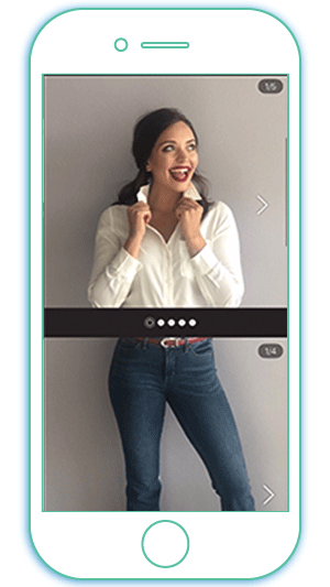
We created an interactive Instant Experience ad for Clothes Mentor Fargo that allows users to mix and match tops and bottoms to create an outfit for themselves.
Templates
Templates make building an instant experience less time-consuming. Each template serves a different purpose and you should choose strategically based on your objectives.
- Instant Storefront can display your products, giving your customer easy access to view and purchase.
- Instant Lookbook allows you to feature your products in action and uses an interactive experience to drive conversions.
- Instant Storytelling features video and imagery to tell your story.
- Instant Customer Acquisition features clear CTAs to drive a specific action.
- Instant Forms are brand new in 2018 and are used to generate leads. A user can quickly fill out a form for more information.
[contact-form-7 id=”7520″ title=”Blog Download – Facebook Ad Template”]
Sprinkle Your CTA Throughout
Don’t forget your call-to-action. You can spread your CTAs throughout your Instant Experience, prompting your audience to easily take the next step. Spreading them throughout will help improve drop off.
Visuals are Most Important
Instant Experiences emphasize visual storytelling. Your images or videos should be the focus of the experience.
The first image or video is the most important because it determines if your target audience will click through to the instant experience. Deciding which format to pair with your Instant Experience is key to its success.
Strategic Objectives and Consistency Drive Facebook Ad Success
Designing effective Facebook ads is not a one-size-fits-all approach. And overall, if you have specific objectives, the right audience and your message and visuals are consistent across the board you should see success.
If something isn’t performing, testing will help you understand what works and what doesn’t.
How Can AdShark Marketing Help
Advertising on Facebook can feel overwhelming. From understanding goals, audience and design it takes a lot of time and resources to be successful.
Digital marketing agencies, have the knowledge, the resources and the experience to help you meet your goals.
Ready to try an agency? Fill out our form and we can provide a free proposal to help with ecommerce marketing, Facebook ads, Google Ads, web design or SEO.
Ready To Grow?
Let's Talk!
