How Your Website Is Losing You Money
As a designer, you want to make it as comfortable as possible for a user to interact with your website. There’s no denying that outdated web standards are running your websites and business’ success. If you’re unsure of where to begin with a website update or a completely new project, take these five tips into consideration. It could save you money in the long run. Below are five reasons your website is losing your money.
Lack of personality on your landing page
Think of your landing page as the first impression. You need to design a professional looking site which people can trust. A visually appealing website will create a sense of ease to the user. Focusing on key elements such as the layout, branding, typography, images, color schemes and more will lead you to success in web design.
No call to action
Call to action (CTA) buttons can be used on your website to invite the user to click for more important information.What does the potential client want from you? A clear phone number, an email address, maybe your new e-book? All these things can be given via CTA buttons, and will drive conversions in for your website!
Misunderstood navigation
Make it as easy as possible for the user to navigate and sift through your website. Consider your delivering your content in chunks. Each page should answer these three basic questions:1.
1.) Where am I?
2.) What is here?
3.) Where can I go from here?
If you’re having trouble understanding your content in chunks, try creating a sitemap. Sitemaps are a visual guide to your complete content.

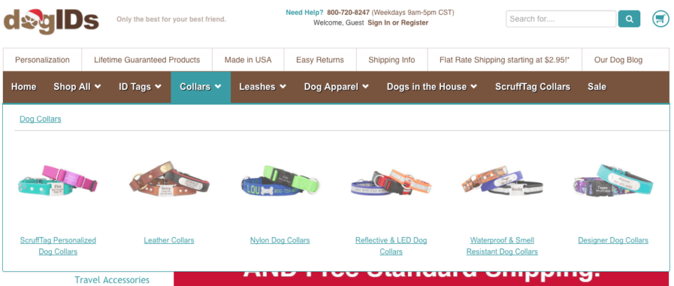
Would you ever guess the crayons were once a part of Stacks and Stack’s navigation? Neither did we! Don’t try to reinvent the wheel, folks.

Screen Shot 2016 11 29 At 4 26 24 Pm
Lack of mobile-specific design
Being able to read your content easily on their phone is necessary. If you’re starting with the mobile first design philosophy, start with the meat and bones of your web content and scale upwards as you move forward towards desktop. Always keep your mobile site clean and minimalistic. Easy navigation is most important here because, more often than not, mobile users are browsing for a very specific reason, and, often times, while on the go. You don’t want to boggle down the user from their end goal with too much content. Pinching at their phone screen to zoom content while squinting their eyes to read is bad user experience. Less is more, think minimalistic and remove anything not necessary to the mobile user. Other thoughts: button spacing, click-to-calls/directions, etc.
Absence of SEO
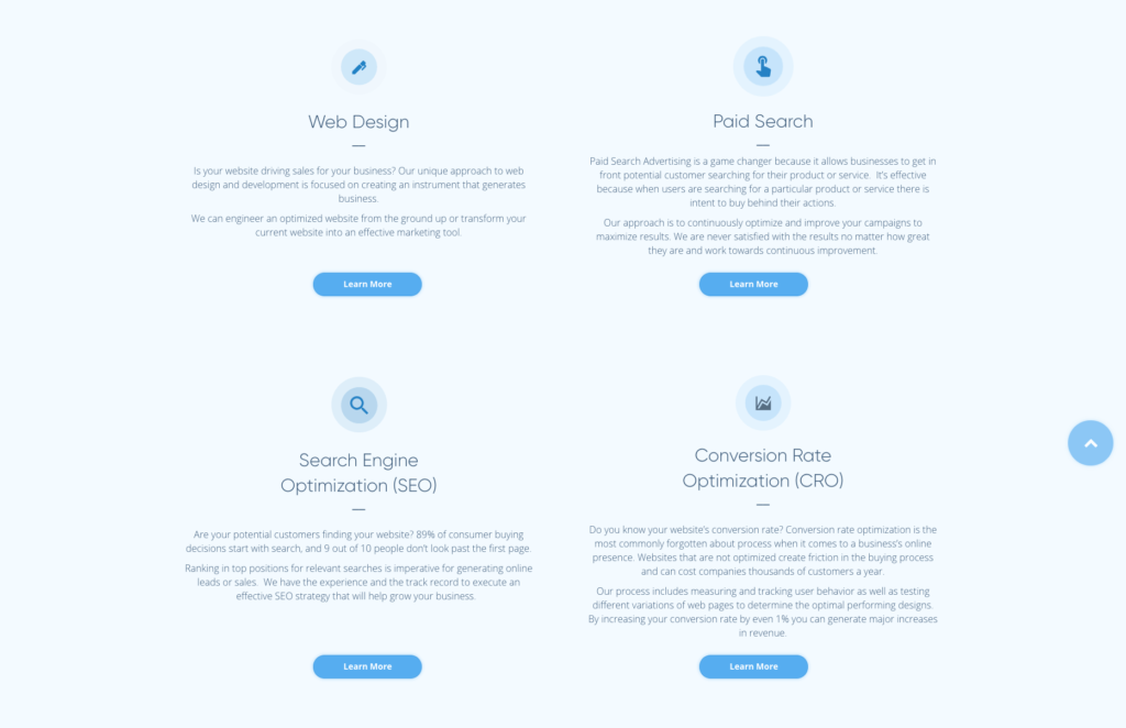
If you’re not analyzing the data, you’re sitting on a well of unused cash. Basically, the summary of SEO is like a more advanced listing of the phone book ads we see in the yellow pages. Instead of having to find the category of what you are looking for, you can just ‘search’ exactly for what you are looking for and have that information come to you instead of you going out to find it.
However, the challenge for SEO is identifying and finding the primary keywords that people are going to use to find your website (i.e. products, services, etc.), like a predictive science. Along with combining marketing, advertising and sales tactics within the website to ‘pull in’ the customer and get them to ‘convert’ (CRO) and purchase from you and not your competitors. Learning how to properly manage all of your ‘searches’ via keywords will help you to understand your user.
In conclusion
Don’t stress how to make web design or SEO work for you. We do it all here at AdShark Marketing! Contact us for a quote on how we can improve your website to help you create more money for your business.
Ready To Grow?
Let's Talk!


